
Hello lovebugs and welcome to this week’s Which Cover Wednesday: CLASSICS EDITION!
Find more information about Which Cover Wednesday here
THE GREAT GATSBY BY F. SCOTT FITZGERALD

OR

I’ve always liked the blue tone of the first cover, so that is obviously my pick. However, I do like the second cover and how the male figure is holding the letter ‘Y’ to represent a martini glass. The first cover is very unique to me and I love the color contrast between the blue background against the rest of the vibrant colors.
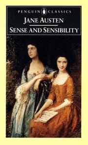
SENSE AND SENSIBILITY BY JANE AUSTEN
OR

For this one I am going with the second cover. I am very fond of vintage anything really, and I also love the tones of color used. There are actually a TON of different covers for Austen’s novels, and the second cover is one of my favorites. The first novel reminds me of a textbook or something, and it wouldn’t be something I would personally showcase.
THE CATCHER IN THE RYE BY J.D. SALINGER

OR

I don’t know about this one…Both are “eh”, but I think I am going to go with the second cover. Simplicity caught my eye this time and the yellow font of the first cover really irritates me for some reason, haha. And I also enjoy the clipart/sketch aspect of the second cover as well.
I hope you all enjoyed this Classics Edition of Which Cover Wednesday! If you have any other ideas like this, I would love to hear them! As always, let me know your thoughts on this week’s picks and opinions!
Thanks for reading & I’ll see you next time…