Random Fact of the Day: An elephant’s tooth can weigh as much as 12 pounds.
Hello sunshines! It is very hot today in California, and I am ready for winter. Today is just one of those days where I want to sit inside, blog, & online shop…
Anyways, Which Cover Wednesday is a post hosted by Sumaya @suereadingcorner. For this post, you choose two different covers of the same book — the books can have different publishers, different formats, etc. Then you decide which one you think is more appealing. Let’s debate:
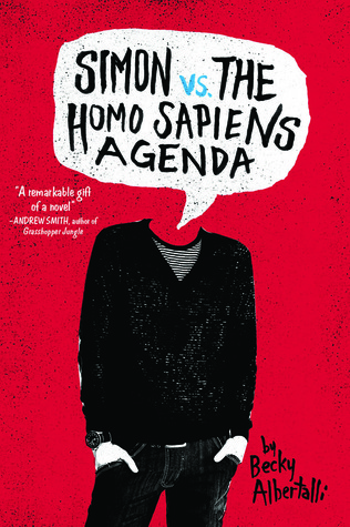
SIMON VS. THE HOMO SAPIENS AGENDA BY BECKY ALBERTALLI
OR

Definitely the first cover. I like the kind of ‘grainy’ effect on the first cover, and the use of the title for the male figure’s head. This might have something to do with the novel, but I wouldn’t know because I haven’t read this one yet xD
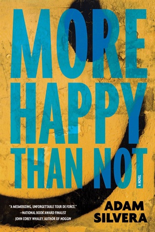
MORE HAPPY THAN NOT BY ADAM SILVERA
OR

Ooo..I don’t know about this one!! I have always been drawn to the first one, but the second cover is just so vibrant and…hmmm…Let me think…Okay, I’m going with the second cover. I like both, but I think the second one would look better on my shelves.
OF FIRE AND STARS BY AUDREY COULTHURST
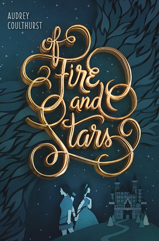
OR

This one is a close one, too, but I’m going with the first cover because the typography is absolutely gorgeous — I love the contrast between the gold & the ocean/peacock blue. The second cover kind of makes the novel look like a middle grade in my opinion, but I really do like how the graphic looks all together.
And there is my Which Cover Wednesday! This week’s was a little challenging, but I would love to hear what you guys think! Did we agree? Or disagree? What covers are generally better in your opinion: contemporary or fantasy?? Let me know in the comments! 🙂
Thanks for reading and I’ll see you next time…
FIND ME ELSEWHERE:


OMG! I agree with you on all of them, although the third one was pretty hard to choose from… As for covers of certain genres, I can’t really say which one is better because each cover is different… It depends more on the designer’s knowledge of the content as well as the audience… 😉
LikeLiked by 1 person
Oh yeah, totally. I actually held a poll on Twitter asking the same thing and most people responded with Fantasy having the better covers in general. And I guess that makes a lot more sense because with Fantasy you can be a little bit more…creative? But you are right — it depends on the designer & their knowledge behind the novel. 🙂 I’m glad we agreed with all of them this time, though!! 😀
-Jess @jbelkbooks
LikeLiked by 2 people
Yayay, I agree with all three of your picks. Maybe it’s because I enjoyed the book so much, and I read the version with cover #1, but I think the top Simon vs. the Homo Sapiens cover is so eye-catching. Someone did really good graphic design with that one. If I’d tried to create a headless design like that it would’ve turned out so weird!
LikeLiked by 1 person
Hahah, I know right! I have yet to read Simon’s, but I’ll definitely take your word for it 🙂 Thank you for commenting like always, Eve!
-Jess @jbelkbooks
LikeLiked by 1 person
I agree with you on the first one, the first cover just looks better, like if I saw it in a shop I’d pick up the first cover instead of the second cover. I kind of prefer the first cover for More Happy Than Not, I like the half smiley face in the background, it kind of matches the inside of the book (in my edition it was smiley faces on the chapter pages)
I also agree with you on the last one as well. The graphics are simple which makes the typography stand out more.
– Yasmin
LikeLiked by 1 person
Oh yeah, I haven’t read MHTN so I understand that you enjoy the first cover better 🙂 Both are pretty good, though — I don’t have many yellow books.
-Jess @jbelkbooks
LikeLiked by 1 person
I don’t either. Are there a lot of yellow YA books?
– Yasmin
LikeLiked by 1 person
Hmm, I don’t recall any really. I only have one yellow book on my shelves & it’s a middle grade 😅
-Jess @jbelkbooks
LikeLiked by 1 person
Yay, we agree on all of them this time!! I knew it would happen eventually lol.
LikeLiked by 1 person
Yaaayy!! 😀
-Jess @jbelkbooks
LikeLiked by 1 person
I definitely agree with your picks although I can’t quite make up my mind on this last one.
LikeLiked by 1 person
Yeah, everyone has been struggling with a decision for the last one xD Thanks for stopping by! 🙂
-Jess @jbelkbooks
LikeLiked by 1 person
Ahh they’re all so lovely, but I have to go with the second, the second and the first! (I love the typography of the Of Fire & Stars one OMG.)
LikeLiked by 1 person
Aww it’s okay, we’ll completely agree next time — don’t worry 😉
-Jess @jbelkbooks
LikeLiked by 1 person
Ohhh we agree on everything here (and I’m not that surprised to be honest haha). I especially love the second cover for More Happy Than Not, the colors, and the whole design would look pretty great on my shelves as well :p
LikeLiked by 1 person
Yes, no surprise that we agreed 😉 I’m always sucker for colorful covers, so yeah, I agree 🙂
-Jess @jbelkbooks
LikeLiked by 1 person
You know whats weird? The first Simon cover has no head and the second one does O_O they complete each other O_O!! That is awesome XD I agree with you on all of these, but I LOVE LOVE LOVE the art for the last book, so I’d chose the second cover because I am a sucker for that kind of thing :)!
I wish I could own all the international covers *sigh*
LikeLiked by 1 person
YOU ARE SO RIGHT, OMG!! *dramatic gasp* I didn’t even realize that until now…I wonder if that was intentional? And yeah, I know right??? It is kind of rare to enjoy a US cover more than a UK/international… ;/
-Jess @jbelkbooks
LikeLike
Pingback: Bi-Weekly Wrap-Up | Jumbled July | ---Blogging Everything Beautiful---
Pingback: Semi-Hiatus for JBelkBooks? | July Wrap-Up! | ---Blogging Everything Beautiful---